A Scalable, Responsive & Professional Design System for Modern Websites
The Designpik Design System is a carefully crafted, production-ready design framework built to help designers, developers, and agencies create consistent, responsive, and high-quality websites faster.
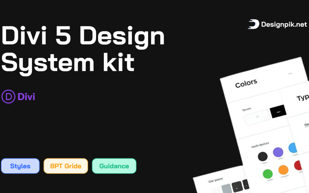
Designed with real-world projects in mind, this system eliminates guesswork by providing clear rules for spacing, typography, colors, layouts, and components, ensuring every page looks clean, balanced, and professional across all devices.
Why Designpik Design System?
Most websites fail due to inconsistent spacing, poor typography, and unstructured layouts.
The Designpik Design System solves this by offering a rule-based design approach, not just visual styles.
Key Benefits
Build pages faster with predefined rules
Maintain visual consistency across the entire site
Scale designs without redesigning layouts
Improve readability, usability, and user trust
Reduce design and development time
Core Features
Professional Typography System
Structured Color System
8-Point Grid & Spacing System
Responsive Layout Framework
Button & CTA System
Accessibility-Focused
What Makes Designpik Design System Different?
✔ Rule-based, not opinion-based
✔ Built for real projects, not just demos
✔ Scalable from small sites to large systems
✔ Client-friendly and easy to maintain
✔ Professional, clean, and timeless design
Final Note
The Designpik Design System is not just a collection of styles.
It’s a design foundation that helps you build better websites, faster, with confidence and consistency.
Whether you’re creating one page or an entire platform, this system ensures your design stays clean, responsive, and professional at every stage.