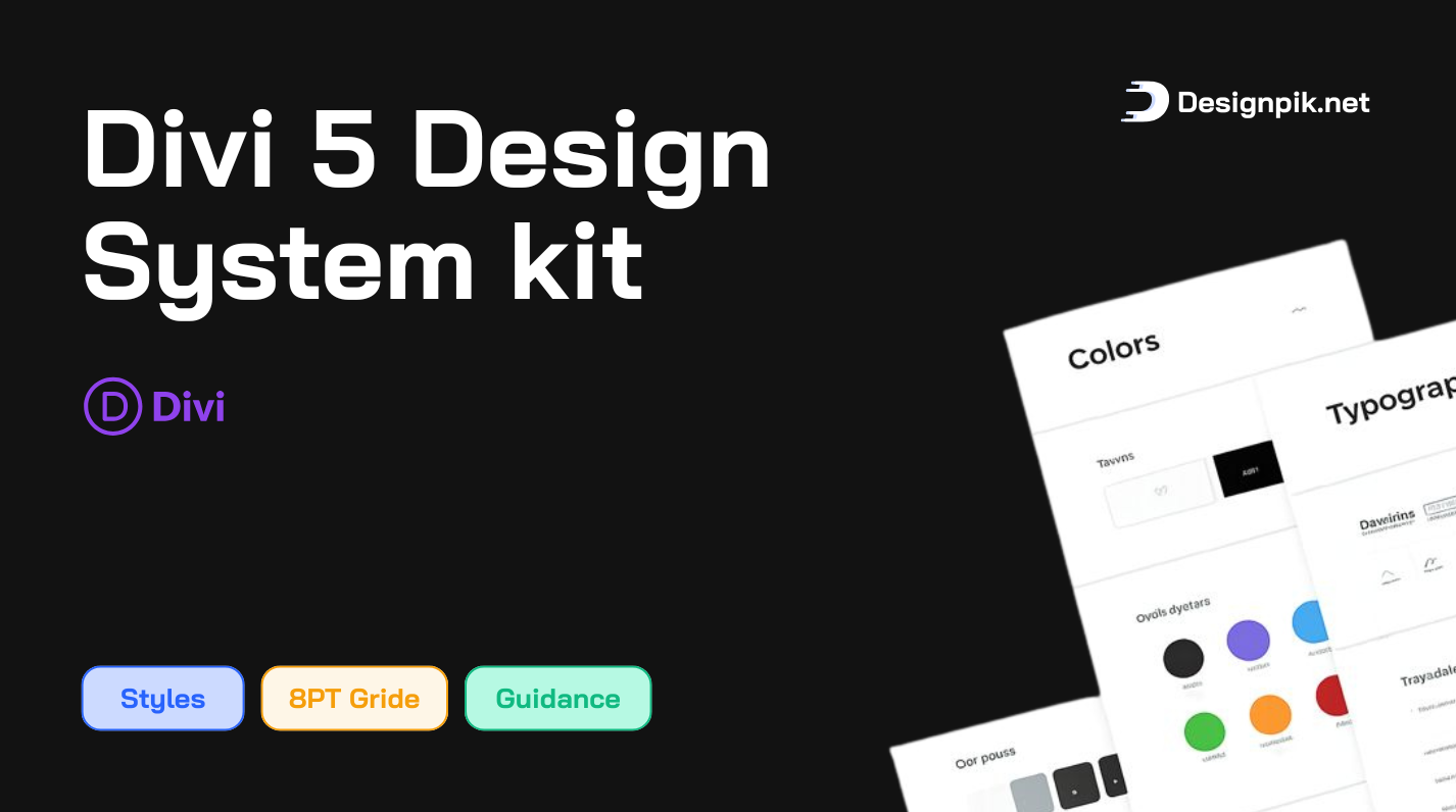
DDS-Divi 5 Design System
A Scalable, Responsive & Professional Design System for Modern Websites
The Designpik Design System is a carefully crafted, production-ready design framework built to help designers, developers, and agencies create consistent, responsive, and high-quality websites faster.
Designed with real-world projects in mind, this system eliminates guesswork by providing clear rules for spacing, typography, colors, layouts, and components, ensuring every page looks clean, balanced, and professional across all devices.
Why Designpik Design System?
Most websites fail due to inconsistent spacing, poor typography, and unstructured layouts.
The Designpik Design System solves this by offering a rule-based design approach, not just visual styles.
Key Benefits
- Build pages faster with predefined rules
- Maintain visual consistency across the entire site
- Scale designs without redesigning layouts
- Improve readability, usability, and user trust
- Reduce design and development time
Core Features
🧱 8-Point Grid & Spacing System
All spacing, padding, margins, and layout sizes are based on an 8pt grid system, ensuring:
.png)
.png)
- Perfect alignment
- Visual rhythm
- Clean and predictable layouts
- Better mobile and responsive behavior
🔤 Professional Typography System
.png)
- Clear heading hierarchy (H1–H6)
- Optimized paragraph widths (50–70ch)
- Fluid font scaling using modern CSS (
clamp) - Balanced line-height and letter-spacing
Result: Readable, SEO-friendly, and editorial-quality layouts.
🎨 Structured Color System
Colors are organized by function, not decoration:
.png)
.png)
.png)
- Primary
- Secondary
- Accent
- Neutral (UI, text, backgrounds)
- State colors (success, warning, error)
Each color includes carefully defined shades for contrast, accessibility, and consistency.
📐 Responsive Layout Framework
- Fluid spacing
- Max-width controlled rows
- Flexible columns
- Mobile-first principles
Layouts scale naturally across desktop, tablet, and mobile without breaking.
🔘 Button & CTA System
.png)
- Primary, Secondary, and Outline buttons
- Clear hover, active, and disabled states
- Consistent padding, radius, and typography
- Optimized for conversions
Recommended CTA usage included (Purchase, Live Demo, Actions).
🧩 Reusable UI Components
Predefined components designed to work together:
- Cards
- Content sections
- Buttons & CTAs
- Forms & UI elements
All components follow the same spacing, typography, and color rules.
♿ Accessibility-Focused
Built with accessibility best practices:
- Proper contrast ratios
- Readable font sizes
- Clear hierarchy
- Usable interaction states
Better experience for all users.
Who Is This Design System For?
- Web designers & UI designers
- Freelancers & agencies
- Divi users & modern CMS builders
- Product designers
- Anyone who wants professional, scalable design without guesswork
Perfect For:
- Business websites
- Landing pages
- SaaS websites
- Portfolio sites
- Blogs & content platforms
- Marketplace products
What Makes Designpik Design System Different?
✔ Rule-based, not opinion-based
✔ Built for real projects, not just demos
✔ Scalable from small sites to large systems
✔ Client-friendly and easy to maintain
✔ Professional, clean, and timeless design
Final Note
The Designpik Design System is not just a collection of styles —
it’s a design foundation that helps you build better websites, faster, with confidence and consistency.
Whether you’re creating one page or an entire platform, this system ensures your design stays clean, responsive, and professional at every stage.


0 Comments